Okay, I am so caught up in various other projects that have caught my interest, that I will simply include both versions and allow downloaders to pick the ones they want to use. Expect new great icons eventually with incredible bevel effects, glassy orbs and metal rings.
Like this one.
:3 good to see something like this!
Do 5/5 sets exist? What do they look like?
Just playin' with you. Rate as you see fit. 
There is an improved version coming. I will replace the current icons in this set with those ones. See my blog for an example of how they would be different.
Set has been updated with new icons. I believe I may revise them again. You cannot see the floating backgrounds very well unless you are looking at the 256x256 versions.
 Erik
on January 12th 2011
0
Erik
on January 12th 2011
0
Good ring but dont forget shadow
There is a black drop shadow on the inside of the ring to give the glass orb an appearance of sitting within the ring and depth. However, the outer edges of the ring extend all the way to the edge of the canvas, so if I were to make an outer shadow, it would only show up in the corners as the vertical and horizontal edge shadows would be off-canvas.
Here's what I've done to it so far.
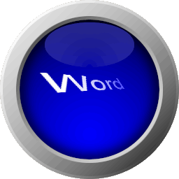
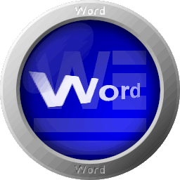
Etched "Word" into the metal frame.
Added a floating Word document.
Adjusted the shine on the orb so that it matches the shine on the metal ring.
Adjusted the inner glow of the orb to also match the shine on the ring.
Redid the word "Word" that stretches out into the distance.
sorry I tried to put it in large print 😮
 Elson159
on July 30th 2011
0
Elson159
on July 30th 2011
0
porque ablan ingles vosotro
you can flay 😎
 cdl
on November 4th 2011
0
cdl
on November 4th 2011
0
4.5 out of 5 stars.
I prefer no words, letters can be alright.. 
4 out of 5 stars.
how did you make it look so s=trancparent! and why the words you chose?
5 out of 5 stars.
Like the 3D glassy effect.
xXSwagkid37Xx
on November 26th 2025
0
5 out of 5 stars.
it looks so cool 😁 100% a 5
Anonymous
on February 6th 2011
0
I like some aspects. The glossy colors seem to be a trend now, and I personally like them.
What you might want to work on are the labels. It may be better to use logos instead of text, as the program names vary in length, which results in assorted font sizes that make it harder for the user to quickly glance.
An italicized W is all you really need to make people recognize that it's microsoft word. You could just go with their one letter abbreviations, or the logo, either works. As long as the sizes are consistent, and it clear which application the icon represents, it'll be awesome.
Anonymous
on October 17th 2011
0
Marbleize emoticons too! Thanks!
Anonymous
on April 28th 2014
0
😮 oh nooooooooooooooooooooooo
policy say 5.000 dollars fack app
 Sign in