Okay, I am so caught up in various other projects that have caught my interest, that I will simply include both versions and allow downloaders to pick the ones they want to use. Expect new great icons eventually with incredible bevel effects, glassy orbs and metal rings.
Like this one.
:3 good to see something like this!
Do 5/5 sets exist? What do they look like?
Just playin' with you. Rate as you see fit. 
There is an improved version coming. I will replace the current icons in this set with those ones. See my blog for an example of how they would be different.
Set has been updated with new icons. I believe I may revise them again. You cannot see the floating backgrounds very well unless you are looking at the 256x256 versions.
 Erik
on January 12th 2011
0
Erik
on January 12th 2011
0
Good ring but dont forget shadow
There is a black drop shadow on the inside of the ring to give the glass orb an appearance of sitting within the ring and depth. However, the outer edges of the ring extend all the way to the edge of the canvas, so if I were to make an outer shadow, it would only show up in the corners as the vertical and horizontal edge shadows would be off-canvas.
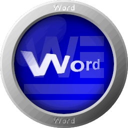
Here's what I've done to it so far.
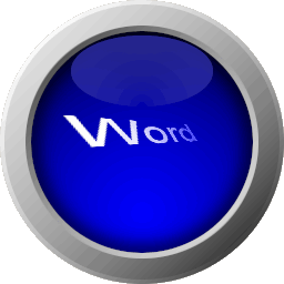
Etched "Word" into the metal frame.
Added a floating Word document.
Adjusted the shine on the orb so that it matches the shine on the metal ring.
Adjusted the inner glow of the orb to also match the shine on the ring.
Redid the word "Word" that stretches out into the distance.
 Sign in
 Share
Share Tweet
Tweet Share
Share Resources
 Top reviews
 GlassyApps Icons
 reddit