 Sign in
 Tweet
Tweet Share
Share
Colors are forever
Published by Vlasta on October 29th 2012.
There is something about image editors and color pickers. Every image editor on the planet has at least one, some have more than one. Yet, despite the obvious necessity of color selection widget, there is no ideal solution. Maybe the quest for the perfect color picker will never end.
And so, without further babbling, let me say that there will be a new color picker in the next RWPaint. Programming it took me the better part of this month and although I am still not satisfied with the outcome, it'll have to do. The following pictures show the old and the new color pickers.
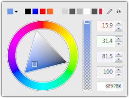  The new picker expanded and collapsed. | 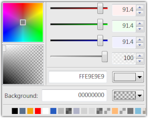 The old color picker. |
Here are some random facts about the new picker:
- The whole picker occupies less space.
- It can be collapsed and expanded using the small arrow in the upper right corner.
- The square in the upper left corner shows the selected color. The small arrow next to it indicates that it is actually a button that works like the color button in the old version (shows a palette with standard and similar colors).
- The icon to the left of the expand/collapse icon is a dropper - when clicked, it allows you to take color from a screen pixel.
- There is no 'Background' color in the new color picker.
- The main, visual, colorful control was given more room.
- The edit boxes work in linear scale.
- The edit box in the lower right corner show the hexadecimal web code of the current color in sRGB.
Was the change actually worth it?
I have been doing a bit of designing lately and found the current color picker pretty useless. The best parts of the old picker were the list of recently used colors and the button with its popup palette of standard colors and the dropper command. The transparency slider was OK, but the RGB sliders were useless - I was unable to find a good color using them or the edit boxes.
The 2 color areas of the old picker have several drawbacks. First, they are small and hence inaccurate. The lower one mixes brightness with opacity, which really is a nonsensical combination. The upper one combines hue and saturation in a way that greatly favors the hue, but makes saturation adjustment a pain. For example, it is virtually impossible to select a gray color, which sits in the center of the rectangle.
So, how can the new picker be better?
First, the most useful parts of the old picker (button, history, dropper) are visible even when collapsed and at the very top of the window.
When expanded, the next most useful part of the old picker (transparency slider) is still there, but in a visually more appealing and explicit form. All the edit boxes were kept for those users, who absolutely require accuracy and for the ability to set and get a web color code when doing web-designing.
I was long contemplating what to use to replace the 2 color squares and finally ended up with the wheel+triangle combo. It is not an ideal solution, but it has a couple of nice properties.
The outer wheel is used to select the hue and nothing else. If you click and drag, you can move the mouse out of the wheel and the further away from the center you are, the more accurately you can select the hue. If you do the opposite - drag towards the center of the wheel, the hue will be quantized, which allows you to easily select basic hues like red or green with exact precision.
The central triangle always has black and white in two corners and fully saturated color in the remaining corner. It is easy to select gray color with arbitrary accuracy by clicking in the triangle and dragging outward across the black-white edge. Again, the further from the triangle, the more accurately you can select the gray level.
The color wheel and triangle can be also controlled by keyboard. The arrow keys influence brightness and saturation while PageUp/PageDown (or Home/End) keys change hue.
Final thoughts
Designing color pickers is surprisingly hard. There are so many ways how to select a color. In the past, the whole color picker consisted of multiple bad color pickers (text boxes, sliders, areas, buttons). This is actually quite typical for badly designed elements. I did not know how to make a good color picker and so I have slapped together some bad ones hoping that them being next to each other will somehow solve the problem. This time, I hope, the result will be more usable.
Actually, what happened to the 'Background' color from the old picker? I'll tell you in my next blog post.
 Recent comments